Ancestry Profile
Increasing profile completion by 20% and elevating messaging rates by 30% through the implementation of a new profile onboarding experience.
Project
Ancestry Profile
Timeline
June – Aug. 2019
Role
Lead designer
Intro
Only 2% of Ancestry customers were completing their profiles, resulting in a low contact rate from other members.
The messaging rate between customers served as a crucial engagement indicator for Ancestry. A higher messaging rate correlated with increased engagement.
Customers were over twice as likely to initiate a conversation with someone who had basic profile information. This likelihood increased to three times when they specifically had a profile photo and a location.
From a business standpoint, customers with a profile photo and location were four times more likely to sign up for a free trial and had a 38% higher subscription sign-up rate.
Goal
Our goal was to increase message-send rate through increasing profile completion.
Improving these metrics would lead to elevated engagement rates and increased subscription and free trial sign-up rates.
I was the lead designer on this project among six other team members. The team included 1 product manager, 4 engineers, and 1 content writer.
Solution
A profile completion experience that guides customers in filling out their profiles.
Design Journey
Customers showed a preference for paced and guided experiences rather than ones where information was presented all at once.
I tested a variety of iterations with customers. The first design featured a vertical progress bar, the second offered a step-by-step guided onboarding experience, and the third involved a series of cards on the profile to complete. Customers preferred the middle design, as it felt less overwhelming to complete.
Design explorations
Initially, the experience required completing 11 steps. I reduced it to 6 steps.
While customers preferred the step-by-step guided onboarding experience, its length still overwhelmed them with the initial amount of information they had to input.
The flow needed to strike a balance – long enough to gather sufficient information for influencing the message rate but not so long that customers felt fatigued. With 11 steps, I attempted to mitigate fatigue by breaking down the steps into milestones and introducing completion messages along the way.
However, this approach didn't alleviate fatigue, and the "Congratulations" completion message led to confusion, making customers believe they had completed the entire process.
Profile completion steps separated into milestones
I reduced the flow to only include the information that had significant impact on the message-send rate.
Some information, like personal attributes, family history experience, and research interests, had minimal impact on the message-send rate. Conversely, profile photos, location, age group, languages, bio, and contact information showed significant influence.
Profile photos and location were particularly crucial, increasing contact rate by 3x, free trial sign-up rate by 4x, and subscription sign-up rate by 38%. Therefore, I positioned them at the start of the flow.
Moving the two most significant steps to the beginning of the flow
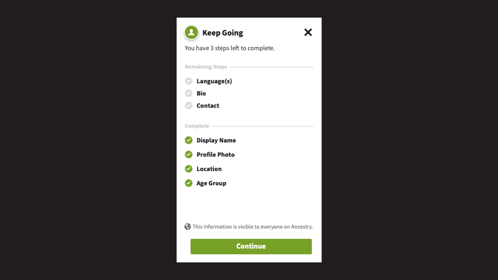
Customers who left the flow before completion found it challenging to recall the steps they had skipped when they returned.
They wanted to see the information they skipped if they wanted to add it later. To address this, I added in a summary page that would appear upon re-engaging with the progress bar. It showed information they hadn't completed and would allow them to pick up where they left off in the flow.
Summary page that opens anytime profile completion meter is clicked
Outcomes
The new experience increased profile completion by 20% and contributed to a 30% increase in message-send rate.
With the introduction of the new experience, there was a notable increase in profile photos being added. As a result, customers became 23x more likely to receive responses to their messages. Apart from profile photos, location, age and languages were the top three pieces of information customers were filling out.


