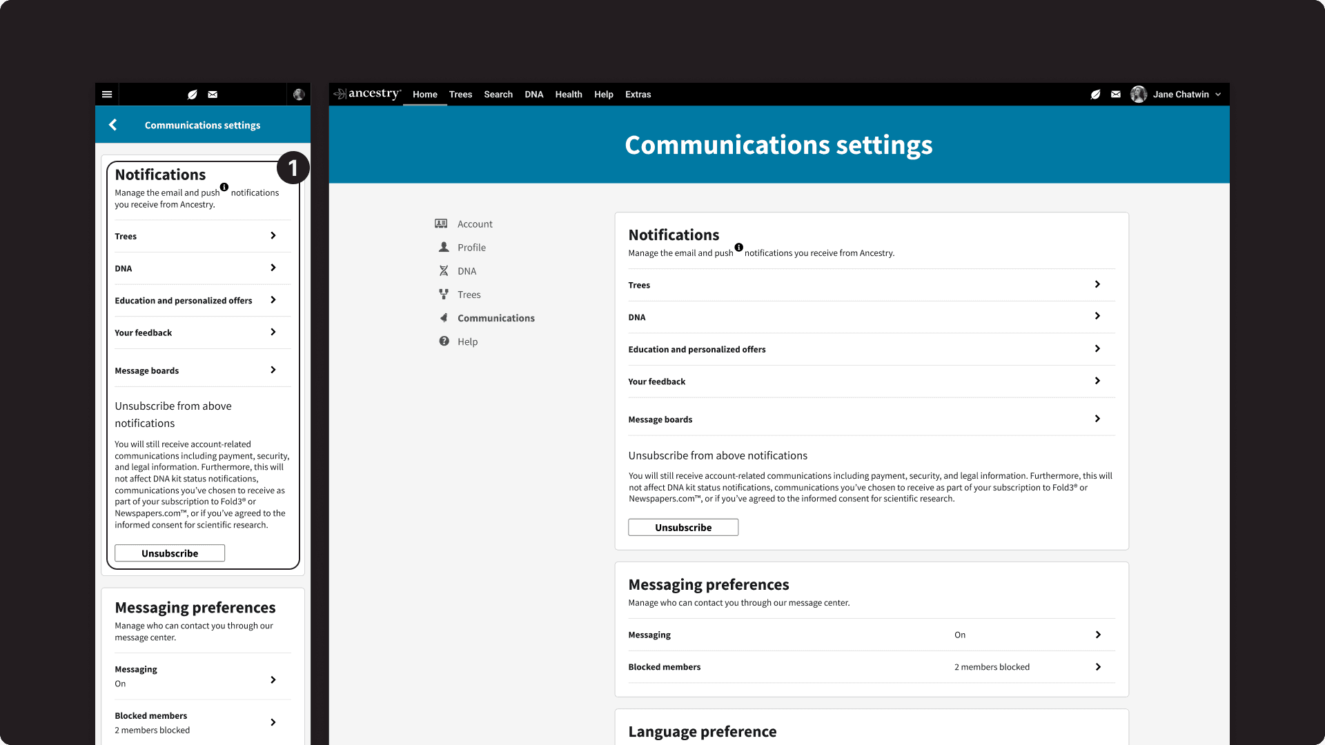
Ancestry Settings
Enhancing customer success rates by 27% through the design and implementation of a componentized, responsive system for sitewide settings.
Project
Ancestry Settings
Timeline
April – Sept. 2021
Role
Lead designer
Intro
Ancestry customers struggled locating and adjusting their settings, leading them to contact member support.
Below are some issues I found with the previous experience.
1
Confusing categories and information architecture with poor task success
2
Vague copy that would change based on the visibility preference
1
Lack of "breadcrumb" navigation that led to poor site navigation
2
Lack of responsive design that resulted in a poor mobile experience
Solution
1 responsive system with 5 main, 25 secondary, and 25 tertiary pages.
1
Simplified categories and information architecture with higher task success
2
Consistent, informative copy with clear call-to-actions
1
"Breadcrumbs" to improve navigation throughout settings
2
Redesigned containers with clear call-to-actions
1
Mobile-friendly, responsive design
Goal
My goal was to decrease both the percentage of member support calls and visits to help center articles related to settings.
To do this, I conducted navigation and visual prototype tests that increased customer success rate in various settings-related tasks.
I was the lead designer on this project among eight other team members. The team included 1 product manager, 1 product designer, 4 engineers, 1 content writer, and 1 user researcher.
Initial insights
Initial navigation tests (V0) confirmed a problematic information architecture, with a low 49% task success rate, indicating prolonged struggles in locating settings.
Another designer iterated on the information architecture of settings through four iterations. I joined the project after the V3 iteration and took over responsibility for the project.
I made adjustments by adding, removing, and renaming categories from previous iterations. In the fourth version (V4), I successfully increased the task success rate to 76%.
Hierarchy changes over rounds of testing
Highlight
Inconsistent language and interaction structure left customers confused about how their changes were affecting their experience.
Example of the problem
This was especially evident in profile visibility settings
1
This setting was influenced by a setting on a different page, but lacked clear transparency
2
This setting would disappear if another setting was turned off
3
Changing the visibility of a setting would change its description
4
Some settings didn’t even appear on the profile
Example of the solution
I implemented a new interaction structure and copy system, ensuring a consistent page hierarchy
1
Providing clear instructions with an active link guiding customers to change a setting
2
Ensuring settings always appear, even if affected by another page's settings
3
Maintaining consistent "action-based" copy, regardless of customer-selected visibility
Copy changes
New interaction strucuture
Highlight
Customers encountered challenges navigating and interacting with the mobile experience.
The combination of small buttons and links with tight spacing led to poor usability throughout the experience. I focused on two major points that reduced navigation and interaction issues.
Small buttons and links
Tight spacing
Solution
Solution
Using a container format to distinguish sections on the page
Highlight
To enhance efficiency in collaborating with developers, I created a componentized kit for all pages and containers.
Engineers were developing pages in the experience as I was finishing them, so I would have to make sporadic changes that would affect the entire experience.
With the kit, if I made a change that affected 20+ containers, the kit would respond accordingly without me having to manually change each container. This process ensured consistency throughout the experience and eased collaboration with developers.
Solution
Dynamic templates served as a quick way to design new pages for engineers as necessary
As more pages needed to be created based on incoming requests from other teams, templatised formats allowed for a consistent and quick handoff process between design and engineering
Solution
Copy and container structure could easily be adjusted and scale to the entire system
With settings being a sensitive area of the product, collaboration with legal and content teams was frequent.
Back-and-forth reviews were quite common, so making large-scale copy and container changes needed to be quick and efficient.
Outcomes
The new experience increased task success rate by 27% from the baseline experience.
Unfortunately I got moved to another team before I was able to see if we achieved decreasing both the percentage of member support calls and visits to help center articles related to settings. Because the project was shipped in stages and these metrics required long-term monitoring, they were never measured to my knowledge.


