Ancestry Onboarding
Boosting subscription sign-up rates by 2% through customer onboarding optimization using a growth experimentation framework.
Project
Ancestry Onboarding
Timeline
Jan. – Feb. 2022
Role
Product designer
Intro
Ancestry struggled to get customers to bill-through to a subscription while in a 14-day free trial.
Free trialers were cancelling for a variety of reasons, with cost being the primary reason. Because cost was outside of our team's scope, I looked at the next two reasons: "Something else" and "I am done researching my family history."
For customers who selected “I am done researching my family history” as an answer, their top two reasons were that Ancestry had “answered the questions [they] had” and that they weren’t “finding anything interesting.” Customers weren't finding value in the product in the initial days of their 14-day free trial.
Reasons for cancellation
Cancellation rate
Solution
A collection of experiments that increased key engagement metrics, laddering up to a 2% boost in subscription sign-up rates.
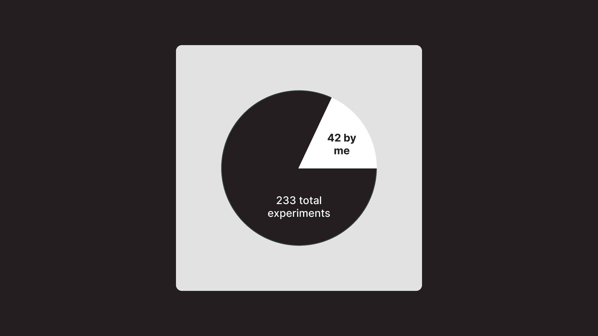
I worked on 42 experiments as part of a growth experimentation framework to optimize the onboarding experience to increase the metrics mentioned above.
My goal was to help increase subscription sign-up rate by 2% through designing experiments that increased key engagement metrics in the onboarding experience.
Some experiments shared a common engagement metric while others differed. Onboarding was a good place in the product experience to design experiments because it's something all customers experience and provides an opportunity to deliver value quickly.
Experiments
A small collection of my favorite experiments.
Select one to learn more.
System error handling
A new loader page that increased the number of family discoveries generated by +7%
Context
50% of free trialers generate a census record at some point in their free trials. However, only 30% of them generate one in the initial onboarding flow. Census records are valuable discoveries because they contain a lot of new information about past ancestors, so how might we increase this percentage?
Census records
Problem
We found a lot of customers weren't generating census records, even though they were filling out the correct information.
Once they finished adding all their family members, they would be taken to a tree building experience with no hints or CTAs.
When customers are faced with blank experiences, they're more likely to cancel their free trial.
Expected outcome
Instead of seeing the previous experience, customers were supposed to see a census record discover experience.
This experience was a step-by-step walkthrough that went into detail about a variety of information about past family members.
Even more importantly, going through this experience would automatically add new family members to a customer's tree.
Discovering the source of the problem
Through discussions with the team responsible for census record generation, we found that there was a lag when referencing a backend API, leading to customers not properly being flagged and missing out on the guided experience, which proved to perform well.
There was also a large discrepancy in census record generation numbers, meaning that we knew customers were generating census hints, just not in our onboarding flow.
Solution
We implemented a 15 second loading screen that allowed enough time to properly check if a customer generated a census record.
The API would be called every 5 seconds and if they customer didn't generate a census record within 15 seconds, it would loop for another 15 seconds.
If a census record was detected at any time within this loop, the customer would be taken to the new experience.
Solution
Loader API flow
Results
By implementing the new loader page, family discoveries generation increased by +7%.
This validated the hypothesis that there was a lag in referencing the backend API and customers weren't being properly flagged for having generated a census record
Unhappy paths
Addressing an "unhappy" path that increased generation of family discoveries by 16%
Context
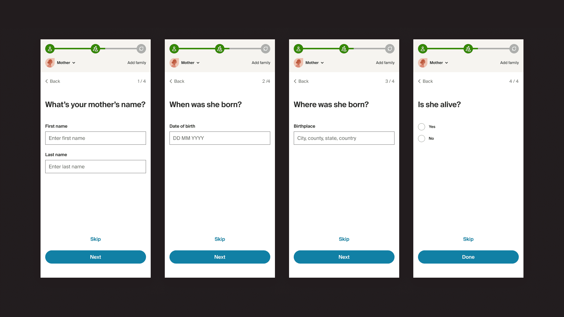
In the customer's first touchpoint with Ancestry, they're asked to fill out information for seven people in their family tree (including themselves).
By filling out this information, it primes our system with reference points to search for additional information about the customer's family.
Once a customer fills out information for these people, they are then shown historical records that reveal new information about their family history. These can be yearbook photos, immigration documents, housing deeds, etc.
Questions the customer is asked when filling out their tree
Initial findings
Through a series of customer interviews and Hotjar recordings that analyzed customer behavior, I found that customers were not adding information for entire people in their tree.
I found that only 67% of customers were being shown a historical record after filling out information for their family.
There were a variety of reasons why customers were skipping entire people. Some wanted to "see the results right way," while others simply didn't want to add a specific relative to their family tree.
In addition, some customers didn't know what they were working toward by adding these people to their tree. These reasons also resulted in customers dropping off in the middle of the flow.
Experimenting with different solutions
I brainstormed three different test ideas to address this behavior.
If customers skip entire nodes, they won’t receive new historical information about their family and won't get value out of Ancestry. This is because our system doesn’t have enough information to reference when trying to find details about the customer’s family.
Experiment 1
Let customers choose who they want to add to their tree
Rather than making a customer go through unnecessary screens that they didn't want to fill out and risk potential drop-off, I let them choose which family members they wanted to add in the beginning of the flow.
Experiment 2
Make sure customers have a record before proceeding to their tree
This served as a way to ensure that after skipping through multiple people in their tree, customers wouldn't be sent to their tree with no historical records. It addressed their skip behavior and suggested a way to help them get value from Ancestry.
Experiment 3
Preview of what a customer will do and how to get started
This accounted for people not understanding what they were working toward by adding people to their tree.
It provided a short preview of what they would do and what would happen after they added a few people.
Results
The second experiment performed the best, increasing historical record generation for customers by +16%.
The first test had negative results, with a -6% decrease in historical record generation.
The thid test had mixed results. While it resulted in a +6% increase in historical record generation, it also resulted in a -3% decrease in tree creation rate. A decrease in tree creation rate meant that customers were seeing the preview of what they would be doing and then dropping off before beginning the flow.
While the second and third test both had positive results, I decided it would be best to only rollout the second test to all customers since it was the only test that successfully addressed all the problems identified in our research.
Measuring long-term success
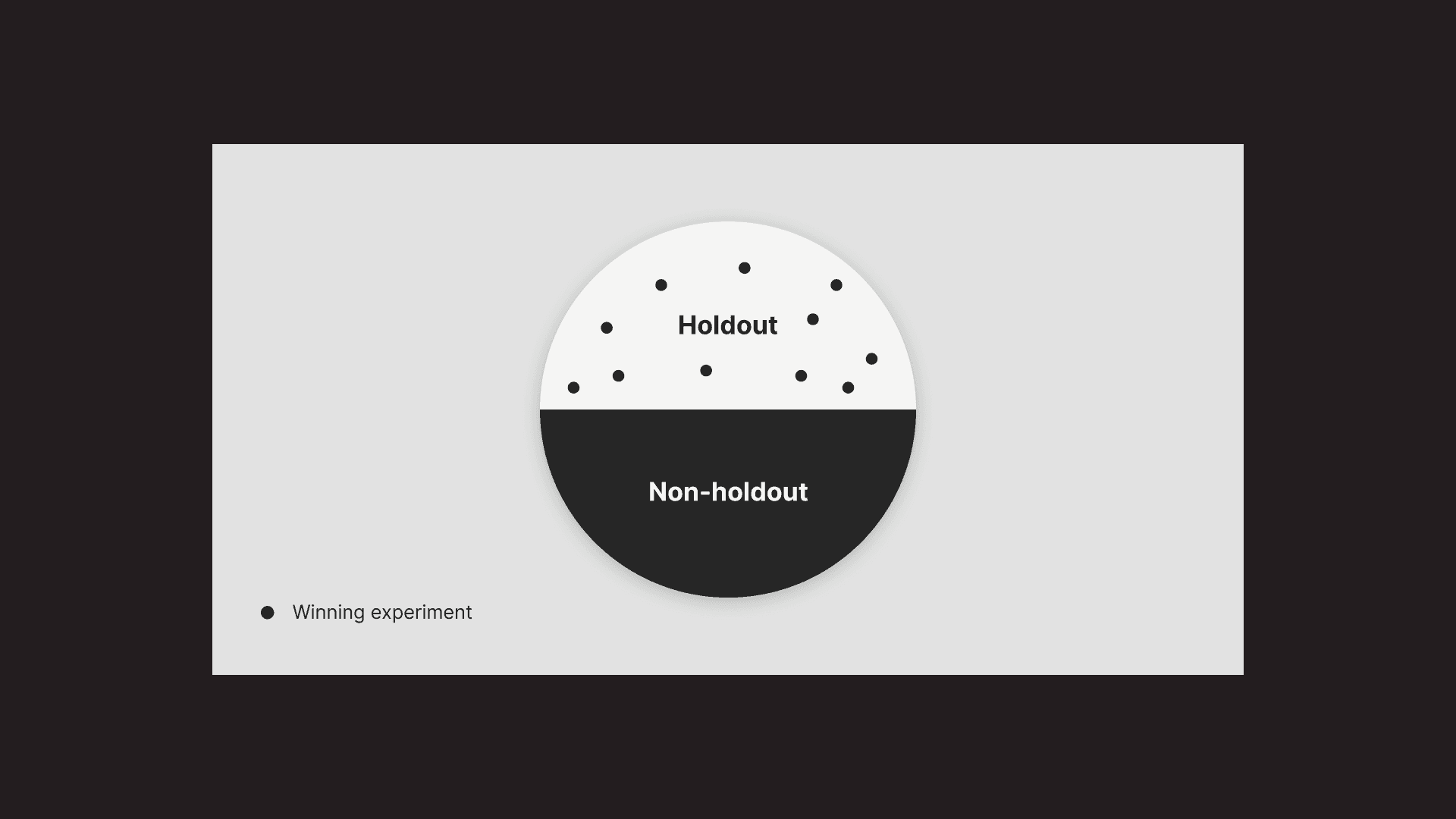
When experiments perform well, they get placed in the “holdout experience.”
50% of all new Ancestry customers are in the holdout experience and see all of our winning experiments. The other 50% never see any of our experiments.
At the end of the year, we compare the bill-through rates of these experiences to see if we succeeded. In our case, we were successfully able to increase subscription sign-up rate by 2% through 233 experiments.
Something extra...
Something that always stood out to me was the disconnect between the mobile and desktop experiences. So, I prototyped an idea to help bridge the experiences and emphasize tree-building.
While the linear, questionnaire format performed well for customers and the business, I felt like the mobile format could include more elements of the tree to give it a similar experience to desktop.
This idea was never built or launched, but something I wanted to do outside of my day-to-day work to spark new ideas.


